Chapter XI
Fixed Income: Pricing, Yields, and Credit Risk
How a bond is priced and quoted, how its value moves with interest rates — duration and convexity — and how the risk of default reshapes the promise.
Introduction
The last of our master pictures is, at first glance, the least dramatic. It is a curve that slopes downward and bows gently — the price of a bond plotted against the interest rate. No hockey-stick kink, no efficient frontier bowing to the northwest; just a smooth line falling from upper left to lower right. And yet this modest curve governs the largest asset class on earth. The world's bond markets dwarf its stock markets, and every pension fund, insurance company, central bank, and government treasury depends on how well it understands the shape of this line.
The picture answers a single, urgent question: when interest rates move, how much does the value of my bonds move? The slope of the curve is the answer, and it has a name that will organize this entire chapter — duration. The gentle bowing of the curve, its convexity, is a second-order refinement that turns out to matter enormously when rates move a lot. We will examine this figure through the same four lenses as the others: the logic of why the curve slopes and bends, how it moves as we change the bond, how a practitioner uses its slope to hedge and to immunize, and — for the willing — the mathematics of duration and convexity.
But a picture needs its subject. Before we vary the yield, we should be precise about the instrument itself — what a bond promises, how those promises become a price, and the small accounting wrinkle that arises because bonds trade every day of the year, not only on the days they pay. That is where we begin.
I. The Bond Contract and Its Price
Before we can watch a bond’s price move against the interest rate, we should be exact about what a bond actually is. A plain bond is defined by four numbers. Its face value, or par, is the amount repaid at the end — conventionally 1,000 for a corporate bond, though we will quote everything per 100 of face so the arithmetic stays clean. Its coupon rate fixes the interest it pays, as a percentage of face. Its maturity is the date the face value comes back. And its coupon frequency says how often the interest arrives. That last number is where a small but universal convention hides.
Coupons Come Twice a Year
In the United States — Treasury notes and bonds, and the great majority of corporate bonds — coupons are paid semiannually. A bond with a “6% coupon” on 1,000 of face does not write you one check for 60 each year; it writes you two checks for 30, six months apart. The stated coupon rate is an annual figure that is split in half and paid twice. It sounds like a triviality, but it changes the pricing formula in two places at once: the cash flows arrive at twice the frequency, and each one is discounted at half the annual yield per six-month period.
Price of a Semiannual Coupon Bond
$$P=\sum_{k=1}^{2n}\frac{cF/2}{\left(1+\frac{y}{2}\right)^{k}}+\frac{F}{\left(1+\frac{y}{2}\right)^{2n}}$$Here $c$ is the annual coupon rate, $F$ the face value, $n$ the years to maturity, and $y$ the annual yield. The sum runs over $2n$ semiannual periods; each pays a coupon of $cF/2$, and the final period also returns the face $F$. Set the coupon equal to the yield and every discounted coupon plus the discounted face sums back to exactly $F$: the bond trades at par. Raise the coupon above the yield and the bond is worth more than face — a premium. Drop it below and the bond sells at a discount. Price and yield are two ways of quoting the same thing; give one and the market can recover the other.
Figure 11.1. Pricing a coupon bond. Each bar is a promised semiannual cash flow — the coupons, and at the far right the last coupon plus the returned face value. The pale bar is the promise; the solid blue portion is its present value, discounted at the current yield, and the blue heights sum to the price. Slide the coupon above the yield and the price rises above 100 (a premium); below, and it falls (a discount); set them equal for par. Notice how the distant bars shrink under discounting — and how the return of principal, that tall last bar, dominates the bond’s value. The maroon marker (▲) sits at the bond’s duration — the present-value-weighted average time to receipt, the balance point of the blue bars: raise the coupon and it slides left as value arrives sooner; extend the maturity and it slides right.
Two features of the figure repay a second look. First, most of a bond’s value is the return of principal, not the coupons: the tall final bar dwarfs the rest, and even after discounting it is usually the single largest piece of the price. Second, the far-off cash flows are discounted so heavily that they add little — which is the seed of the duration idea — already marked as the balance point on the figure — that we take up in full next. A bond is a schedule of promises, and discounting weighs the near ones far more heavily than the distant ones.
Clean and Dirty Prices: Accrued Interest
A bond pays its coupon on fixed dates, but it trades every business day. Buy a bond three months into a six-month coupon period and you are buying a claim that is already halfway to its next coupon — interest has been quietly accumulating inside it that, by long convention, belongs to the seller who held it through those months. So the buyer reimburses the seller for it. That reimbursement is the accrued interest, and it is added to the quoted price to arrive at the amount actually paid.
Accrued Interest and the Two Prices
$$\text{Accrued}=\frac{C}{2}\times\frac{\text{days since last coupon}}{\text{days in the period}},\qquad \underbrace{P_{\text{dirty}}}_{\text{invoice}}=\underbrace{P_{\text{clean}}}_{\text{quoted}}+\text{Accrued}$$The market quotes the clean price — the one on the screen — precisely so that the number does not lurch about for a purely mechanical reason. If bonds were quoted at the full invoice, or dirty, price, every quote would climb a little each day as interest accrued and then drop by the coupon on the payment date, tracing a sawtooth that has nothing to do with whether the bond had become more or less valuable. Stripping the accrual out leaves the clean price free to move only when the market genuinely re-prices the bond. The buyer still pays the dirty price; it is the clean price that gets published.
Figure 11.2. Clean versus dirty price, for a 5% bond paying 2.50 every six months. The flat blue line is the quoted (clean) price; the gold sawtooth is the invoice (dirty) price the buyer actually pays. Between coupon dates the gold line climbs as interest accrues — the shaded wedge is the accrued interest — then drops by the coupon amount on each payment date, when the accrual resets to zero. Drag the settlement cursor and watch the accrued interest grow linearly across each period. Quoting the clean price keeps that mechanical sawtooth out of the number on the screen.
II. The Logic: A Fixed Promise, Discounted
We now hold the bond’s promises in one hand and the market’s valuation in the other. The promises — the coupons and the final repayment of principal — are frozen at issue and do not change. What changes, minute by minute in the market, is what investors are willing to pay for them, and that price, as we have just seen, is nothing more than the present value of the promised stream, discounted at the prevailing interest rate. From here on we hold the promises fixed and ask a single question: as the yield moves, what does the price do?
This is the compound-growth picture of Chapter I, run in reverse. There, a dollar today grew into more dollars tomorrow. Here, a dollar promised for tomorrow is worth less than a dollar today, and we discount it back:
Bond Price as Present Value
$$P = \sum_{t=1}^{n} \frac{C_t}{(1+y)^t}$$where $C_t$ is the cash flow at time $t$ (a coupon, and at maturity the coupon plus the face value), and $y$ is the yield — the single interest rate that discounts the promised stream back to its market price. The whole chapter lives inside this one formula. The bond's promises, the $C_t$, are frozen. The yield $y$ is the variable. Ask what happens to $P$ as $y$ moves, and you have drawn the picture.
Why the Curve Slopes Down
The direction is immediate and, once seen, unforgettable. Every term in the sum has $y$ in its denominator. Raise the yield and every denominator grows, so every discounted cash flow shrinks, so the price falls. Lower the yield and the reverse happens. Bond prices and interest rates move in opposite directions — always, mechanically, by the very structure of discounting. This inverse relationship is the single most important fact in fixed income, and it trips up newcomers precisely because it feels backwards. The bond's promised payments have not changed one cent; only the rate at which we value them has. When your neighbor complains that rising rates “cost” the bond fund money, this falling curve is exactly what they have run into.
There is a plain-language way to feel it. Suppose you hold a bond paying a 3% coupon and new bonds start paying 5%. Nobody will pay full price for your stale 3% bond when they can buy a fresh 5% one, so the market price of yours must fall until its lower coupons, bought at a discount, deliver the same 5% yield a buyer could get elsewhere. The price drops to restore fairness. Rising rates make old promises less valuable.
Key Idea: Price and Yield Move Inversely
A bond's cash flows are fixed; its price is their present value at the current yield. Because yield sits in every denominator, a higher yield discounts every payment more heavily and the price falls. The bond price–yield curve therefore slopes downward. This is not a market opinion or a behavioral quirk — it is arithmetic.
Why the Curve Bows
The curve does not fall in a straight line. It is convex — it bows toward the origin, steep on the left where yields are low and flattening as yields climb. This shape has real consequences, so it is worth understanding why it is there. Each cash flow is discounted by $1/(1+y)^t$, and this function is itself convex in $y$: as the yield rises, each additional increment of yield subtracts a smaller amount from the present value than the increment before it. The price falls at a decelerating rate, so the curve lies above its tangent at every point.
This works in the bondholder’s favor. Because the curve bows, a drop in yields raises the price by more than an equal rise in yields lowers it: gains from falling rates slightly exceed losses from rising rates of the same size. Convexity, as we will see, benefits the holder, and investors pay for it.
Figure 11.3. The price–yield curve and its tangent. The bold curve is the bond's price as a function of its yield — falling and convex. Slide the maturity and coupon to watch the curve steepen and bow: longer maturities and smaller coupons make it plunge more sharply. Tick show tangent to draw the straight line just touching the curve at the current yield — its slope is the bond's duration, the local sensitivity of price to rate. Tick shade convexity gap to fill the sliver between that straight tangent and the true curve: because the curve bows above its tangent on both sides, the duration estimate always understates the price, and that sliver is the bond's convexity. (The convex price–yield curve lived as yield-book tables and actuarial calculus — Hicks 1939, Redington 1952, Malkiel 1962 — long before it was routinely drawn; it was popularized by Homer & Leibowitz, Inside the Yield Book (1972). “Duration” is due to Macaulay 1938.)
Use it to manage interest-rate risk. Duration is the slope of this curve — a one-number estimate of how far a bond's price moves when yields shift. Match the duration of what you own to the timing of what you owe, and a change in rates leaves your net position roughly unchanged. That is immunization.
The four lenses for reading each picture ↗III. How It Moves
One bond gives one curve. But the steepness and the bow of that curve are not fixed features of “bonds” in general — they depend on the particular bond, and understanding what makes the curve steep or shallow is the heart of managing interest-rate risk. Two features of the bond do most of the work: its maturity and its coupon. A third input, the level of yields itself, tunes the curvature.
Duration as the Slope
Before we push the sliders, let us name what we are watching. The slope of the price–yield curve — how many dollars of price you lose per unit of yield — is the bond's duration. Draw the straight line tangent to the curve at today's yield, and duration is (up to a scaling) that line's slope. It is the single number that summarizes a bond's exposure to rates: a bond with a duration of 7 will lose roughly 7% of its value if yields rise by one percentage point. Everything in this lens is really a statement about how the slope of the tangent changes as we alter the bond.
There is a second, equally valid reading of duration that gives the concept its name. Duration is a weighted-average time to receipt of the bond's cash flows — each payment date weighted by how much of the bond's present value arrives on that date. A five-year zero-coupon bond pays everything at year five, so its duration is exactly five years. A five-year coupon bond returns some value earlier, along the way, so its “average” payment arrives sooner and its duration is less than five. The two readings — duration as slope, duration as average waiting time — are the same quantity seen from two sides, and each illuminates a different part of the picture.
Maturity Steepens the Curve
Longer maturity means steeper slope. A distant cash flow is discounted through more compounding periods, so a change in the yield acts on it with far more leverage — the exponent $t$ in $(1+y)^t$ amplifies the effect. Stretch a bond's maturity from two years to thirty and its price–yield curve tilts from nearly flat to precipitously steep. This is why long-term bonds are the volatile end of the fixed-income market: a thirty-year Treasury can lose a quarter of its value on a two-point rise in yields, while a two-year note barely flinches. Longer maturity, longer duration, more rate risk.
Coupons Shorten Duration
The coupon works the other way. A bond that pays large coupons returns much of its value early, pulling the average time-to-receipt — and thus the duration — forward, flattening the curve. A bond that pays nothing until maturity, the zero-coupon bond, concentrates all its value at the final date and so has the longest duration of any bond of its maturity: its duration equals its maturity exactly. For two bonds maturing on the same day, the one with the smaller coupon has the longer duration and the steeper, more rate-sensitive curve. Duration, then, is not the same as maturity; it is maturity adjusted for how front-loaded the cash flows are.
Key Concept: What Drives Duration
A bond's duration — the slope of its price–yield curve and its interest-rate risk — rises with maturity and falls with the coupon. Longer-dated, lower-coupon bonds have the longest durations and swing the most when rates move. A zero-coupon bond has a duration equal to its maturity; every coupon-paying bond has a duration shorter than its maturity.
The Level of Yields Tunes the Curvature
Finally, where you sit on the curve matters. At low yields the curve is steepest and most sharply bowed; at high yields it flattens out. Discounting is a compounding process, and its effects are most violent when rates are near zero — which is exactly why the era of ultra-low interest rates after 2010 left bond portfolios with historically enormous durations, and why the sharp rate increases of 2022 inflicted some of the worst bond losses on record. The same one-point move in yields does more damage when it starts from a low base. Convexity, the bowing itself, is largest for long, low-coupon bonds at low yields — the same bonds that carry the most duration.
IV. How You Use It
Duration is not a classroom abstraction; it is the working number of the fixed-income world. Traders quote it, risk managers limit it, and the largest institutions on earth build their entire asset–liability strategy around it. Three uses matter most: measuring the risk, hedging it, and immunizing against it.
Measuring: DV01 and Dollar Duration
The trading desk rarely speaks of percentages; it speaks of dollars. The practical measure is DV01 — the “dollar value of an 01,” the change in a position's value for a one-basis-point (0.01%) move in yield. It is simply duration translated into the currency of profit and loss. A portfolio with a DV01 of $50,000 gains or loses that much for each basis point rates move; multiply by a hundred and a full percentage-point move is a $5,000,000 swing. DV01 (also called dollar duration) lets a manager compare the rate risk of wildly different positions — a handful of long bonds against thousands of short ones — on a single common scale. It is the fixed-income analogue of the Value-at-Risk number from Chapter III: a way to express an abstract sensitivity as a concrete sum of money at stake.
Hedging: Neutralizing the Slope
Once risk is a single number, hedging becomes arithmetic. To protect a bond portfolio against rising rates, a manager takes an offsetting position — shorting Treasury futures, receiving in a swap, selling long bonds — sized so that its DV01 is equal and opposite to the portfolio's. If the portfolio loses $50,000 per basis point and the hedge gains $50,000 per basis point, the combined position is, to first order, indifferent to small rate moves: the slopes cancel. This is duration hedging, and it is performed continuously, in enormous size, across the world's bond desks. The tangent line of Figure 11.3 captures the entire idea: match slopes so the net position stays flat.
But note the phrase “to first order.” A duration hedge cancels the slope, not the bow. For small moves the straight tangent tracks the curve closely and the hedge holds. For large moves, convexity reasserts itself — the true curve pulls away from the tangent — and the hedge no longer holds. Sophisticated managers therefore hedge convexity as well as duration, matching the curvature of assets and liabilities so the position stays flat even through violent moves. This is where the second-order term in the mathematics below becomes important.
Immunization: Matching Assets to Liabilities
The most consequential use of duration belongs to institutions with long-dated promises to keep: pension funds that owe benefits for decades, and life insurers that owe claims far into the future. These liabilities are themselves a stream of fixed future cash flows — which means they have a present value and a duration exactly as a bond does, and their value swings with interest rates just as a bond's does. The danger is a mismatch: if the fund's assets and its liabilities respond differently to rates, a move in yields can open a gap between what it owns and what it owes, even if both were perfectly balanced yesterday.
The remedy is immunization: build the asset portfolio so that its duration equals the duration of the liabilities. Then a rise in rates that shrinks the assets shrinks the liabilities by the same proportion, and the funded status — the surplus of assets over obligations — is protected from the swing. The institution has neutralized its interest-rate risk not by predicting rates but by matching slopes. This single idea, that a pension or insurer should match the duration of what it owns to the duration of what it owes, is the organizing principle of liability-driven investment, the framework by which trillions of dollars of retirement and insurance money are managed today.
Figure 11.4. Immunizing a pension against interest-rate risk. Two present-value curves fall with yield: the fund's assets and its liabilities, matched in value at today's 5% yield. Drag the yield cursor and watch the surplus — the shaded gap between them. Dial the asset duration to match the liability duration and the two curves descend in lockstep: the surplus barely stirs, whatever rates do — the fund is immunized. Introduce a duration gap and a rate move pries the curves apart, opening a deficit or a windfall. Matching slopes, not forecasting rates, is what keeps the promise safe.
V. The Yield Curve
So far we have spoken of the interest rate, as if there were only one. There is not. A three-month Treasury bill, a two-year note, a ten-year bond, and a thirty-year bond each trade at their own yield, and plotting those yields against their maturities traces out the yield curve — the term structure of interest rates. It is the most closely watched picture in all of fixed income, and the figure below draws it live from the U.S. Treasury, as of the latest business day.
Figure 11.5. The U.S. Treasury yield curve, live. Each point is the yield the market demands for a given maturity, from one month to thirty years; the line through them is the term structure of interest rates. Its usual shape slopes gently upward. Watch it flatten or invert — long yields dropping below short ones — and you are watching the bond market lower its forecast for future rates, the signal that has preceded almost every modern recession. Drawn live from the U.S. Treasury, updated each business day. Tick show the forward path to overlay the one-year forward rates the curve implies — the market’s own forecast of future short rates.
Reading the Curve as a Forecast: Forward Rates
Why should the curve slope at all? One powerful answer is the expectations hypothesis: a long yield is roughly an average of the short rates the market expects to prevail over the life of the bond. Lending for ten years should return about the same as rolling a one-year loan over ten times — otherwise investors would crowd into whichever route paid more — so the ten-year yield already contains today’s one-year rate together with the market’s forecast of the nine one-year rates still to come. Read this way, the slope of the curve is a forecast: an upward slope says the market expects short rates to rise, and an inversion says it expects them to fall.
Buried in the curve is a precise number for each future period — the forward rate, the rate you can effectively lock in today for a loan that begins in the future. It follows from a no-arbitrage argument: investing for two years must return the same as investing one year and reinvesting at a one-year rate agreed now, so $(1+y_2)^2 = (1+y_1)(1+f)$, which gives the one-year forward rate, one year out, as $f = (1+y_2)^2/(1+y_1) - 1$. Tick show the forward path on the figure above to overlay these implied one-year forwards (gold, dashed) on the spot curve (blue). Where the forwards ride above the spot curve, the market is pricing in rate increases; where they dip below — as they must when the curve inverts — it is pricing in cuts. This is exactly what is meant when the bond market is said to be “forecasting the Fed”: the forecast is arithmetic performed on today’s prices.
The hypothesis is only a first approximation. Long yields also carry a term premium — extra compensation for the greater price risk of long bonds, the very duration we measured earlier in the chapter — so a steep curve reflects both expected increases and that premium, and the forward rates somewhat overstate the market’s true forecast. Even so, the forward curve is where every fixed-income desk begins when it wants to read the market’s mind.
Using the Curve: Growth, Inflation, and How Much to Trust It
A single nominal yield is really a stack of forecasts. Strip out inflation and what remains is the real yield — the return investors demand after inflation, which rises and falls with expected real growth. The split is observable, because the Treasury publishes both curves daily: the real (inflation-protected, TIPS) yield is the growth component, and the difference — breakeven inflation — is the market’s expected inflation, plus a small inflation risk premium (D’Amico, Kim & Wei, 2018). Add the term premium of the previous section, and a long yield decomposes into three readable pieces: an expected real short rate, compensation for duration risk, and expected inflation.
Analysts read these pieces for different questions, and the most watched is the slope. An inverted curve — short rates above long — has preceded every modern U.S. recession, and the Federal Reserve still publishes a recession probability from the ten-year-minus-three-month spread (Estrella & Hardouvelis, 1991; Estrella & Mishkin, 1998). The signal is genuine: Rudebusch & Williams (2009) found the simple spread beats professional forecasters at calling recessions a few quarters out.
But it is a signal, not an oracle, and this section would be dishonest without the caveats. Its predictive power lives in the expectations part of the slope, not the term premium (Benzoni, Chyruk & Kelley, 2018) — so once quantitative easing compressed term premia, the raw slope became a distorted gauge: a curve can invert on a shrinking premium with no recession implied at all. Lead times run from six months to two years, false alarms happen, and the most recent episode is the cautionary tale — the 2022–2024 inversion was the longest in modern history, yet no recession followed. Even Campbell Harvey, whose dissertation first proposed the indicator, called that inversion a likely false signal. The broader lesson is the one Dimson, Marsh & Staunton draw from 125 years of global data: historical market signals are informative, but their out-of-sample power is weaker than the in-sample fit suggests.
Anatomy of a yield, live. Each bar splits a Treasury yield into the expected real rate (the growth signal), an assumed term premium (compensation for duration risk — slide to set it, since it is not directly observed), and expected inflation (breakeven = nominal − real). Real yields come from inflation-protected securities. The recession probability applies the Estrella–Mishkin probit to the 10-year–3-month spread — read it with the caveats above; it misfired through the 2022–24 inversion. Drawn live from the U.S. Treasury.
Beyond forecasting, the curve is the working tool of fixed income: its spot and forward rates are the discount factors for every dated cash flow, and let a treasurer lock in a future borrowing rate today; an upward slope pays a bondholder to hold duration (carry and roll-down); pension funds and insurers discount their liabilities along it — the immunization of Section IV; and it is the riskless benchmark from which every credit spread is measured.
The curve’s shape is not fixed — and the first person to show that was David Durand, who in 1942 fitted a “basic” yield curve for every year back to 1900 and laid them all on one axis. Superimposed, they fan from steeply upward-sloping in easy-money years to downward-sloping when short-term money was dear — the whole range of shapes the live curve above still moves through.
Redrawn after David Durand, Basic Yields of Corporate Bonds, 1900–1942 (NBER, 1942), “Superimposed Basic Yield Curves” — the earliest systematically plotted family of yield curves. The term structure ranges from steeply upward-sloping in easy-money years to downward-sloping when short rates are high.
VI. Default Risk
Everything so far has assumed the promised cash flows are certain; the only question was how to value a sure stream as interest rates move. For a U.S. Treasury that is very nearly right — the payment will arrive. But a corporate bond, or the bond of a foreign government, faces a second and entirely different risk: the borrower may simply not pay. This is default risk — also called credit risk — and it is the other great hazard of fixed income. Interest-rate risk asks what a sure promise is worth as rates change; default risk asks whether the promise will be kept at all.
Promised Yield Is Not Expected Return
The yield to maturity we computed in Section I assumed that every coupon and the full face value arrive on schedule. For a bond that might default, that number is the promised yield — the return you earn if nothing goes wrong. It is not your expected return, because sometimes something does. To be held at all, a risky bond must promise a higher yield than a Treasury of the same maturity; the difference is the credit spread. But the spread is not free money. Part of it merely offsets expected losses from default; only what remains is genuine compensation for bearing the risk.
Promised Yield, Spread, and Expected Return
$$\underbrace{y_{\text{promised}}}_{\text{YTM}}=\underbrace{r}_{\text{riskless}}+\underbrace{s}_{\text{credit spread}},\qquad \mathbb{E}[\text{return}]\approx y_{\text{promised}}-\underbrace{p\times \ell}_{\text{expected loss}}$$Here $p$ is the probability of default and $\ell$ is the loss given default — the fraction of value not recovered. A number makes it concrete. Suppose a bond promises 8% when Treasuries yield 4%, a spread of 4%. If the bond defaults with probability 3% a year and, in default, holders lose 60% of value, the expected loss is about $0.03\times0.60=1.8\%$ a year. Your expected return is then roughly $8\%-1.8\%\approx6.2\%$ — not the 8% on the screen. The remaining 2.2% of spread is your reward for bearing the risk. The promised yield always overstates what you can expect to earn; the gap is the expected loss you have quietly agreed to absorb.
Key Idea: The Yield You Are Quoted Is a Promise, Not a Forecast
Quoted yield to maturity is the return assuming full and timely payment. For any bond that can default, expected return is lower — by the expected loss, the default probability times the loss given default. Two bonds with the same promised yield can have very different expected returns if one is far likelier to default than the other.
Debt and Equity as Options: The Capital-Structure Waterfall
Where does default risk come from, structurally? Chapter IX gave the key: the equity of a firm financed with debt is a call option on the firm’s assets, struck at the face value of the debt, and the debt is a riskless bond minus a put. Bring that lens to a firm with a genuine priority structure — senior debt paid first, then junior (subordinated) debt, and equity last. At maturity the assets are worth $V$, and they are distributed in strict order of priority:
- The senior lenders take the first slice: they receive $\min(V,\,F_s)$, the smaller of the asset value and their face $F_s$.
- The junior lenders take what is left, up to their own face: $\min\!\big(\max(V-F_s,0),\,F_j\big)$.
- The shareholders keep the residual and nothing less than zero: $\max(V-F_s-F_j,\,0)$.
The three payoffs always sum to $V$: whatever the firm is worth, someone owns it. And each tranche is a spread of options. Senior debt fails only if $V$ falls below $F_s$; junior debt is impaired the moment $V$ dips below $F_s+F_j$; equity is wiped out in that same event, yet it alone owns the entire upside. Drag the figure’s sliders and watch the priority waterfall — and the distribution of where the firm might land — do the rest.
Figure 11.6. A firm’s capital structure as options on its assets. Top: the payoff to each claim as a function of the firm’s value $V$ at maturity — senior debt (blue) fills first up to its face, junior debt (gold) next, equity (green) takes the residual; stacked, they always sum to $V$. Bottom: the probability distribution of $V$ at maturity, tinted by outcome — red where the firm cannot cover its senior debt, gold where it covers senior but not junior, green where all debt is paid and equity has value. Raise the asset volatility and the distribution fans out: more mass slides below the debt thresholds, the bonds’ default probabilities climb and their value falls, while equity — a call option — gains from the fatter upside. The conflict of interest between bondholders and shareholders is right there in the geometry.
The figure makes visible a conflict that sits at the heart of corporate finance. Because equity is a call option, its value rises with the firm’s risk: a wider spread of outcomes fattens the upside the shareholders keep while their downside is capped at zero. The bondholders own the mirror image and feel the opposite — more risk only deepens their exposure to default. Shareholders of a distressed firm can therefore prefer a wild gamble that its creditors would refuse. This is not a market imperfection; it is the geometry of options, now stretched across an entire balance sheet. It is also why bond contracts bristle with covenants, and why credit analysis is, at bottom, the pricing of a put.
A History of Default: Russia’s Bonds
Default risk is easy to underrate in calm times, so it helps to look at a spectacular instance. In 1822 Nathan Mayer Rothschild floated a 5% loan for the Russian Empire in London — roughly £3.5 million, and a genuine landmark: it is widely regarded as the first sovereign bond denominated and payable in sterling rather than the borrower’s own currency. A holder could clip coupons in London, Paris, Frankfurt, Vienna, or St. Petersburg. For nearly a century it was a fine investment. Imperial Russia paid, through wars and revolutions and financial panics, decade after decade — the London coupon stamps on surviving certificates run deep into the nineteenth century and beyond.
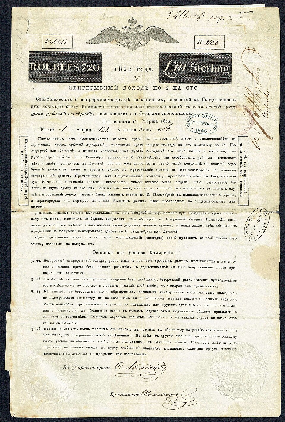
Then the promise was broken all at once. In early 1918 the new Bolshevik government repudiated every debt of the Tsarist state by decree. Holders of Russian bonds — French and British households above all, who had been sold Russian paper as the safest of investments — were left with beautiful, worthless certificates. Only generations later did they recover anything: a 1986 settlement between Britain and the USSR, and a 1997 accord between France and Russia, together returned on the order of one percent of the original claims.
The 1822 bond is default risk written large. Here was the grandest name in Europe, floated by the most powerful bank of the age, an impeccable payer for ninety-five years — and then a near-total loss that no duration calculation could have anticipated. Interest-rate risk would have told you how the bond’s price wobbled as yields moved. It would have said nothing about the risk that actually mattered. Promised yield is not expected return; and the difference, once in a long while, is nearly everything.
VII. The Mathematics (optional)
The three lenses above require no calculus. But duration and convexity have exact definitions, and for readers who want to compute rather than merely picture them, the formulas are clean and worth seeing. They also make precise the two readings of duration — average waiting time and price sensitivity — and show why they are the same number.
Derivation: Macaulay and Modified Duration
Start with the bond price and take its derivative with respect to the yield — the slope of the price–yield curve. From $P = \sum_t C_t (1+y)^{-t}$,
$$\frac{dP}{dy} = \sum_{t=1}^{n} -t\,C_t\,(1+y)^{-t-1} = -\frac{1}{1+y}\sum_{t=1}^{n} \frac{t\,C_t}{(1+y)^t}.$$The sum on the right is a present-value–weighted count of the cash-flow times. Frederick Macaulay's insight in 1938 was to normalize it by the price, producing a weighted-average maturity — the time at which the bond’s value “arrives” on average:
Macaulay Duration
$$D = \frac{1}{P}\sum_{t=1}^{n} \frac{t\,C_t}{(1+y)^t}.$$Each cash-flow time $t$ is weighted by the fraction of the bond's present value that arrives at $t$; the weights sum to one, so $D$ is a genuine average, measured in years. This is the “average waiting time” reading. Now substitute it back into the derivative:
$$\frac{dP}{dy} = -\frac{D}{1+y}\,P.$$Define modified duration as $D^{*} = D/(1+y)$, and this becomes the sensitivity reading — the fractional change in price per unit change in yield:
Modified Duration and the Price–Yield Slope
$$D^{*} = \frac{D}{1+y}, \qquad \frac{1}{P}\frac{dP}{dy} = -D^{*}.$$There is the unity of the two pictures: the same $D$ that measures the average time to receipt of the cash flows also measures, after dividing by $1+y$, the slope of the price–yield curve. Average waiting time and price sensitivity are one quantity. The dollar version, $\text{DV01} = D^{*}\cdot P \cdot 0.0001$, is what the trading desk actually monitors.
Derivation: The Duration–Convexity Approximation
Modified duration captures the slope, but the price–yield curve bows away from any straight line. To capture the bow we carry the Taylor expansion of the price one term further, to second order in the yield change $\Delta y$:
$$\Delta P \approx \frac{dP}{dy}\Delta y + \frac{1}{2}\frac{d^2P}{dy^2}(\Delta y)^2.$$The first term is the duration effect we already have. The second involves the second derivative, which defines convexity:
Convexity
$$\text{Convexity} = \frac{1}{P}\frac{d^2P}{dy^2} = \frac{1}{P}\sum_{t=1}^{n} \frac{t(t+1)\,C_t}{(1+y)^{t+2}}.$$Dividing the whole expansion by $P$ gives the workhorse formula that fixed-income managers use to reprice a bond after a rate move without recomputing the entire present value:
Duration–Convexity Price Change
$$\frac{\Delta P}{P} \approx -D^{*}\,\Delta y + \tfrac{1}{2}\,\text{Convexity}\,(\Delta y)^2.$$Read the two terms as the two features of the picture. The first, $-D^{*}\Delta y$, is the straight tangent line — it slopes downward and, alone, would predict symmetric gains and losses. The second, $+\tfrac12\,\text{Convexity}\,(\Delta y)^2$, is always positive (convexity is positive for ordinary bonds) and grows with the square of the move, so it adds value whether rates rise or fall. That is the mathematical statement of the convexity advantage: the curve lies above its tangent on both sides, so duration alone always understates the bond's price, and the convexity term supplies the missing gain. It is negligible for a small change in rates and decisive for a large one — which is exactly when a duration-only hedge fails and a convexity-matched one holds.
VIII. Summary
A bond begins as a contract — a face value, a coupon paid twice a year, a fixed maturity — and its price is simply the present value of that promised stream. Price and yield are two names for one thing: quote either and the market recovers the other. When the coupon beats the yield the bond trades at a premium, below it at a discount, and exactly at par when the two agree. Because bonds change hands between coupon dates, a buyer also reimburses the seller for accrued interest; the quoted clean price strips that mechanical sawtooth out of the dirty price actually paid.
The bond price–yield curve is the quietest of our master pictures and, by dollar volume, the one that governs the most wealth. Its logic is the logic of discounting run in reverse: a bond is a fixed stream of promises, its price is their present value, and because the yield sits in every denominator, the price falls as the yield rises. That is why the curve slopes down. Because discounting decelerates, the curve also bows — it is convex — and the bow works to the bondholder’s benefit, since gains from falling rates outrun losses from rising ones.
The slope of that curve is duration, at once the average time to receipt of the cash flows and the sensitivity of price to yield. It lengthens with maturity and shortens with the coupon, and it is largest, along with the convexity, for long, low-coupon bonds at low yields. Practitioners turn the slope into a dollar figure — DV01 — to measure risk, offset it to hedge, and match it across assets and liabilities to immunize the promises of pensions and insurers. The bow, convexity, is the second-order refinement that decides whether a hedge survives a large move. From Macaulay's 1938 statistic to today's trillion-dollar liability-driven mandates, this single downward, bowing curve — and the two numbers that describe its slope and its bend — is how the world measures and manages the risk in a fixed promise.
Duration, though, prices only the movement of a sure promise. A corporate or sovereign bond faces a second and quite different risk: that the promise is broken. For such a bond the quoted yield to maturity is merely a promised yield — the return if all goes well — and the expected return is lower by the expected loss, the probability of default times the loss it inflicts. The extra yield a risky bond must offer, its credit spread, is part compensation for that expected loss and part reward for bearing it. Seen through the options lens of Chapter IX, the equity of a levered firm is a call on its assets and its debt a riskless bond minus a put; stacked across senior, junior, and equity claims, an entire capital structure becomes a waterfall of options, and rising asset volatility shifts value from the bonds to the equity. The 1822 Russian loan — an impeccable payer for ninety-five years, then repudiated at a stroke in 1918 — is the standing reminder that no duration calculation can see the risk that matters most. Promised yield is not expected return.
Key Concept: The Two Risks of a Fixed Promise
A bond’s price is the present value of its promised cash flows, discounted at the yield, so price and yield are equivalent quotations. Two risks then govern it. Interest-rate risk is measured by duration — the slope of the convex price–yield curve, equal to the present-value-weighted average time to the cash flows — and managed by hedging and immunization, with convexity the second-order refinement that always favors the holder. Default risk is the chance the promise is not kept: it makes the promised yield exceed the expected return by the expected loss, and it is priced, structurally, by treating a firm’s securities as options on its assets. Master both, and you can value — and manage — the largest asset class on earth.